In today’s fast-paced digital world, a responsive website is the cornerstone of success. Moreover, responsive web design ensures that your site looks and functions perfectly on any device, from desktops to smartphones. With mobile devices accounting for the majority of web traffic, failing to adapt is no longer an option. Let’s dive into why responsive Web design is crucial for modern websites in 2025 and how you can implement it effectively.
Table of Contents
In This Article:
- What is Responsive Design?
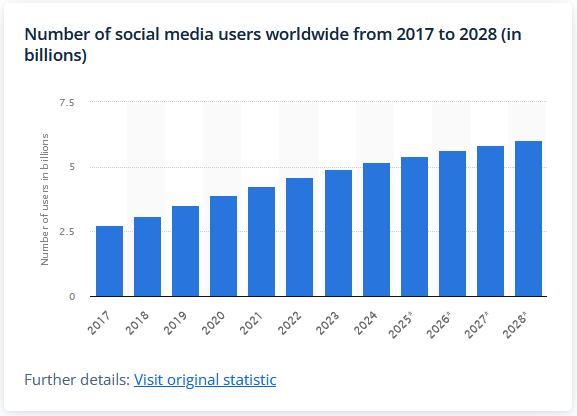
- The Rise of Mobile Users in 2025
- Global Analytics: The Impact of Mobile Responsiveness
- Why Responsive Web Designs is Non-Negotiable
– Improved User Experience
– Enhanced SEO Rankings
– Cost-Effective Maintenance - Best Practices for Mobile Responsive Design
– Flexible Grid Layouts
– Scalable Images and Media
– Mobile-First Approach
– Optimize Navigation for Touch Interfaces
– Test Across Multiple Devices - Case Studies of Stunning Responsive Designs
– Example 1: Airbnb
– Example 2: Slack - How to Get Started with Responsive Design
- Conclusion
What is Responsive Design?
Responsive design is a web development approach that ensures a website’s layout adjusts smoothly to different screen sizes and resolutions. As a result, your content remains accessible and visually appealing, regardless of the device being used.
The Rise of Mobile Users and Responsive Web Design in 2025
As of 2025, mobile internet usage dominates the digital landscape. In fact, the average user now spends over four hours daily on mobile devices. Therefore, businesses must meet these evolving habits to remain competitive. Device-responsive Web layout bridges this gap by providing seamless experiences across all platforms.
Global Analytics: The Impact of Responsive Mobile Design
60% of global internet traffic originates from mobile devices (Statista, 2024).
53% of users abandon a website if it takes more than 3 seconds to load on mobile (Google, 2024).
Websites with responsive design experience an increase of up to 20% in user retention and conversions (HubSpot, 2024).

Why Responsive Web Designs is Non-Negotiable
1. Improved User Experience with Responsive Web Design
Users expect websites to load quickly and adapt effortlessly to their devices. Thus, a responsive site provides optimal viewing and interaction experiences, increasing user satisfaction and retention.
2. Enhanced SEO Rankings Through Responsive Web Design
Search engines like Google prioritize mobile-friendly websites in their rankings. Consequently, a device-responsive web layout boosts your site’s visibility, driving more organic traffic.
3. Cost-Effective Maintenance with Responsive Design
Device-responsive layouts eliminate the need for multiple website versions, reducing development and maintenance costs while ensuring consistency across all devices.
GET IN TOUCH WITH OUR TEAM
Schedule a Meeting
Best Practices for Mobile-Friendly Responsive Design
- Flexible Grid Layouts: Use percentage-based widths to allow content to adjust dynamically to various screen sizes.
- Scalable Images and Media: Employ CSS techniques like max-width to ensure images resize smoothly without losing quality.
- Mobile-First Approach: Prioritize mobile users by designing for smaller screens first and scaling up for desktops.
- Optimize Navigation for Touch Interfaces: Create larger buttons, clear menus, and intuitive gestures to enhance usability on touchscreens.
- Test Across Multiple Devices: Continuously test your website on a range of devices and browsers to identify and resolve any issues.

Source: Webflow
Case Studies of Stunning Responsive Web Designs
Airbnb
Airbnb’s website adapts beautifully to all screen sizes, ensuring seamless browsing for travelers. Its design emphasizes intuitive navigation and quick access to essential features.
Slack
Slack’s responsive platform supports remote teams worldwide. In addition, its clean, adaptive interface ensures effortless communication across devices.
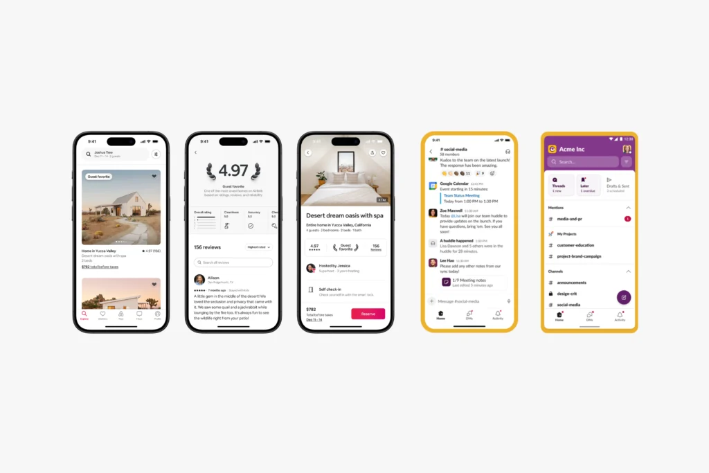
Source: Airbnb & Slack. Image Designed by ClientSync Team
How to Get Started with Device-Responsive Websites
- Analyze Your Audience: Use analytics tools to understand which devices your visitors use most frequently.
- Choose a Responsive Framework: Frameworks like Bootstrap or Foundation simplify the development of responsive websites.
- Hire a Professional Developer: Work with experts to build a robust and scalable responsive site tailored to your needs.

Get Connected To us and Take your business to the next level.
Our highly experienced tech development team is one call away from you!
Responsiveness is no longer optional in 2025—it’s essential. In conclusion, by embracing responsive principles, businesses can deliver exceptional user experiences, improve search rankings, and secure their place in the competitive digital landscape. Don’t wait—start optimizing your website today to meet the demands of tomorrow.